Introduction
Choosing the right colors for your photoshoot can make a significant impact on the outcome of your headshots. The right colors can make you pop out from the background, draw more attention to your face, and accentuate your best features. Conversely, some colors can take away from your appearance, causing distractions or making you blend into the background, which we don’t want. At Duane Furlong Studios, we’ve put together a guide on colors you should generally avoid in a photoshoot to ensure you get the best results.
1. Bright Neon Colors
While neon colors can be fun and energetic, they often don’t translate well in photos. They can cause a color cast on the skin, making you look unnatural. Furthermore, neon colors can be overly distracting, drawing the viewer’s attention away from your face and to your clothing. If you want to include brighter colors, opt for more muted or pastel versions that won’t overwhelm the image.
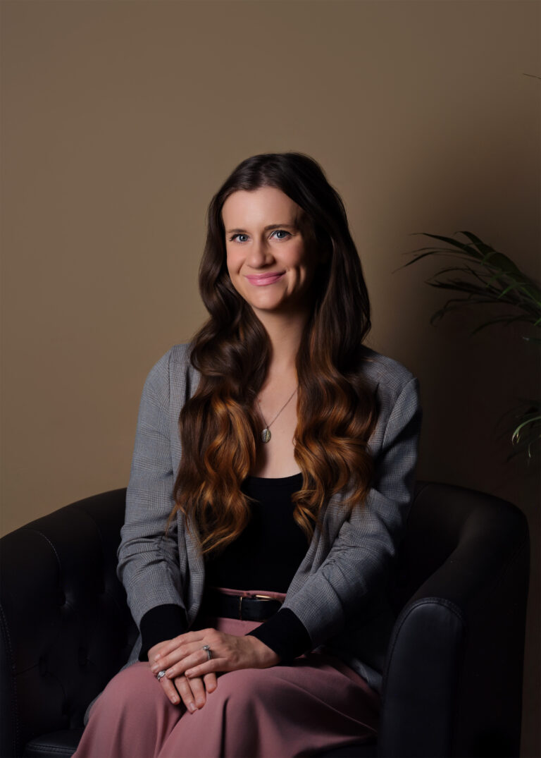
2. Pure White or Black
While black and white can be classic clothing colors, they can pose challenges in photography. White can cause excessive glare and make it difficult to see detail in the clothing. It can also cause the camera to underexpose the photo, making you look darker. On the other hand, black can absorb too much light, causing a lack of detail and possibly overexposing the rest of the image. Instead, opt for off-white or cream and dark gray as alternatives. However, I have had many clients wear white and black and the images came out great. If you would like to wear white or black, make sure you tell me beforehand and we can discuss any changes we need to make.
3. Colors That Blend With Your Skin Tone
It’s also important to avoid colors that closely match your skin tone. These can cause you to appear washed out or can make it difficult to distinguish where your clothing ends and your skin begins. The goal is to create some contrast between your skin and your clothing, so consider wearing colors that compliment but stand out from your natural skin tone.
4. Loud Patterns
While technically not a color, it’s crucial to avoid clothing with loud or distracting patterns, this includes accessories like ties as well. These can divert attention away from your face and make the image feel chaotic. If you love patterns, choose smaller, more subtle designs that won’t overpower the image.
5. Colors That Clash With the Background
If we have discussed the background color or setting of your photoshoot, avoid colors that will clash. For instance, if your photoshoot is in a park with lots of greens, a bright green outfit might make you blend into the background. If you do not have a background in mind, make sure you talk with your photographer before choosing an outfit, and bring extra outfits just in case!
Choosing the right colors for your photoshoot can significantly enhance your photos, helping you look your best, differentiate your brand, and ensure that the focus stays on you. However, remember that these are guidelines, not rules. The most important thing is that you feel comfortable and confident in what you’re wearing.
At Duane Furlong Studios, we’re committed to ensuring that you feel at ease and look amazing during your headshot or personal branding session. We’re always here to provide guidance and advice, helping you choose the best colors for your photoshoot.
Do you need staff headshots for your company?
I offer professional headshots, environmental business portraits, corporate photography, and event photography throughout Arizona.
Email: Duane@duanefurlongstudios.com
Phone: 480.201.7204