Let’s talk about something that seems simple but can make or break your professional headshot: the background.
After shooting thousands of headshots in our Scottsdale studio and on-site at corporate offices across Arizona, I can tell you that background color isn’t just about what “looks nice.” It’s about what works for your specific industry, brand, and how you want to be perceived.
And yeah, we have strong opinions on this.
Why Background Color Actually Matters
Here’s the thing most people don’t realize: your headshot background is doing psychological work before anyone even reads your bio. A dark, moody background sends a completely different message than a clean white one. A bluish-gray creates an entirely different feeling than stark white. None of them are wrong—they’re just saying different things about who you are professionally.
We see this play out constantly. A real estate agent books a session wanting whatever’s “standard.” But when we show them how bluish-gray creates more depth and sophistication than plain white, they immediately see the difference. It’s still professional, still clean—just elevated.
Our Go-To Backgrounds (What We Actually Shoot Most)
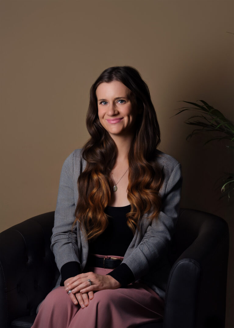
Gray and Bluish-Gray


This is what we shoot probably 70% of the time for corporate clients, and it’s our favorite for good reason. Gray, whether it’s a true neutral gray or one with blue undertones, gives you all the professionalism of a light background without the flatness of pure white.
Bluish-gray specifically has become our signature. It photographs beautifully, adds subtle dimension, and has just enough coolness to look modern and polished without feeling cold. It works for literally every industry we’ve shot: tech companies, law firms, medical practices, financial advisors, you name it.
Here’s why we love it: the slight color variation keeps the photo from looking too sterile, but it’s neutral enough that it won’t clash with any website design or brand aesthetic. Plus, skin tones pop against gray in a way that just doesn’t happen with stark white.
Most of our corporate headshot days? We’re rolling with various shades of gray. It’s timeless, it’s sophisticated, and five years from now, these headshots will still look current.
White (When Companies Ask For It)
White (When Companies Ask For It)
Real talk? We’re not huge fans of pure white backgrounds, but we shoot them all the time because companies request them. And look, we get it—white is clean, it’s safe, it matches what everyone else is doing, and some brands have strict style guides that call for it.
When a company specifically asks for white, we deliver. We make it work. But if you’re open to our recommendation? We’re probably going to suggest gray or bluish-gray instead. You’ll get the same clean, professional look with more depth and visual interest.
The exception: if your entire team already has white background headshots and you need consistency, then white it is. We’re not going to make one person stand out like a sore thumb.
Custom Brand Colors


Purple, Blue, Teal, Red—Whatever Your Brand Needs
Here’s where it gets fun. We regularly shoot headshots with brand-specific background colors, and when it works, it really works. Your team’s headshots all have that cohesive branded look, your website feels intentional, and there’s a visual thread tying everything together.
We’ve done deep blues for tech companies, purples for creative agencies, teals for wellness brands, warm oranges for energy companies—you name it. If it’s part of your brand identity, we can make it work as a background.
But here’s the thing: not every brand color photographs well as a headshot background. That electric lime green that looks amazing on your logo? Might make people look seasick in a photo. This is where we step in during the planning phase. We’ll look at your brand colors, test how they photograph, and tell you honestly what will work and what won’t.
The key is making sure the color supports the person, not overwhelms them. We adjust lighting, exposure, and positioning to make sure you’re the star of the photo—the background is just a supporting player.
Our Real Recommendation Process
When clients ask “what should we do?”, here’s how we actually approach it:
1. We look at your brand first. If you have established brand colors and visual identity, we start there. Show us your website, your marketing materials, your logo. Let’s see if incorporating those colors makes sense.
2. We consider your industry. Some industries have unspoken rules. Finance and legal tend to be more conservative—grays work beautifully. Creative agencies and tech companies? You have more flexibility to go bold.
3. We think about consistency. If you’re shooting a whole team, we need everyone on the same background. If you’re updating your headshot and your team already has photos, we need to match what exists.
4. We default to gray when in doubt. If you’re genuinely open to anything, we’re probably suggesting bluish-gray or neutral gray. It’s our sweet spot—polished, modern, works everywhere, and ages well.
Want to talk through what background would work best for your team or your specific situation? Let’s chat—we’ll figure it out together.